
 Monetization
The 2026 Guide to Designing Business Cards with AI: Data, Workflows, and Real Results
The 2026 Guide to Designing Business Cards with AI: Data, Workflows, and Real Results
There is something quietly thrilling about a well-made business card. For years, designing one felt like a closed club—you needed expensive software, a trained eye, and a budget that could absorb failed print runs. That club has now opened its doors. AI tools have turned the design process into a conversation: you bring the ideas, the tools bring the speed. Here is the entire journey, from blank canvas to a finished stack of cards in your hand.
The Cost Revolution: What AI Changes About Design Budgets
Let us start with the elephant in the room: money. Hiring a professional designer is a wonderful investment if you have the budget, but for a solo freelancer, a new startup, or a small business owner just getting their feet wet, that cost can feel like a wall. AI has not torn down the wall entirely, but it has built a very convenient door.
Consider the tools now available. Canva, which launched Magic Studio in October 2023, offers a Pro subscription for around 12.99 dollars a month—a suite of AI features, templates, and stock assets that would have cost a small fortune a decade ago. Midjourney, in public beta since July 2022, publishes tiers at 10, 30, and 60 dollars a month. DALL-E 3, released by OpenAI in October 2023, is included with ChatGPT Plus at 20 dollars a month, and Bing Image Creator offers free access. Adobe Firefly, launched in March 2023, is integrated into Photoshop and Illustrator, and the Adobe Photography plan runs around 10 dollars a month.
What This Means: You can assemble a complete design toolkit for less than the cost of a single dinner out. The real currency is time and experimentation, not dollars. AI does not replace your taste—it amplifies your ability to execute it quickly. And the budget you save is best redirected toward better paper stock and finishes, which we will discuss later.
Typography and Color: How AI Supports the 60-30-10 Rule
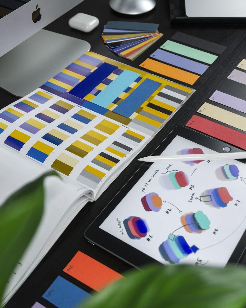
Typography and color are the soul of a business card. The classic 60-30-10 rule is your best friend here: 60 percent dominant colour, 30 percent secondary colour, 10 percent accent. This ratio creates balance and prevents visual chaos. AI tools are remarkably good at helping you explore this space, but they need your guidance.
Start with your brand essence: your logo, your exact brand colours in hex codes, and three tone keywords—words like "warm," "precise," or "playful." Feed these into an AI image generator like Midjourney or DALL-E 3 and ask for pattern or texture ideas. You are not looking for a finished card; you are looking for a direction. Generate a dozen options, pick one that resonates, and vectorize it for print.
When it comes to type, remember the classic pairing guidance: serif typefaces read as authority, which suits legal and financial professions, while geometric sans-serifs read as modern and tech-forward. AI is notoriously weak at rendering text, so always overlay critical type in a vector tool like Canva or Figma—the collaborative design tool that announced its AI features at Config 2024.
What This Means: The 60-30-10 rule is not a law, but it is a safety net. Check contrast against the WCAG AA standard of 4.5 to 1, and remember that about 8 percent of men have some form of colour vision deficiency—never rely on colour alone. If your accent colour is the only thing separating your phone number from your email, you are creating a barrier for a significant part of your audience.
The Workflow: From Blank Canvas to Print-Ready PDF
The workflow I teach is simple and repeatable—five steps designed to prevent panic at the final stage.
Step one: Generate. Use AI to create patterns, textures, and background elements that reflect your brand keywords. This is your raw material. Do not fall in love with anything yet.
Step two: Vectorize. Convert your favourite generated element to a vector format. Most AI generators produce raster images, which can look pixelated when printed. Vectorizing is the difference between a crisp card and a blurry one.
Step three: Layout. Open Canva or Figma and build your card at the standard size of 3.5 by 2 inches (89 by 51 millimetres). Iterate quickly, test variations against a grid, and experiment with the 60-30-10 rule. AI generates the visual elements; the layout is where your design sense takes the lead.
Step four: Check. This is the quality gate: contrast for accessibility, typography legibility at small sizes, and quiet space around the QR code.
Step five: Export. Export as PDF/X-1a with at least 3 millimetres of bleed, CMYK colour space, and embedded fonts—the industry standard that ensures your design extends to the edge without white lines.
What This Means: This workflow is about doing the right work, not more work. AI accelerates steps one and three, giving you more time for steps four and five—the ones that actually determine print quality. The process is forgiving, but the export step is not. Get that wrong, and all your creative effort is wasted.
A Real-World Walkthrough: Designing a Card That Works
Let me walk you through a typical project, the way I approach this with clients. Imagine a freelance photographer named Alex, with brand keywords of "natural," "candid," and "warm," a simple leaf-mark logo, and a palette of deep forest green and soft cream.
We start in Canva Magic Studio, generating a subtle film-grain texture. We make ten options, pick one, and vectorize it. The texture becomes the background, taking about 60 percent of the visual weight; the cream fills text blocks and negative space, about 30 percent; and a warm amber accent is reserved for the logo and a single thin line separating name from contact details—the 10 percent.
For typography, we choose a geometric sans-serif for the name and details—modern and approachable—while the logo itself uses a serif for established authority. We lay the card out in Figma and test two variations: a centred logo (formal) and a corner logo (candid). We go with the corner version, matching Alex's keywords.
Before printing, we generate a mockup with Placeit or Smartmockups, both from Envato. It immediately reveals a problem: the QR code sits too close to the edge and would be partially cut off. We move it inward a few millimetres and enlarge the contact details, which are too small for comfortable reading.
What This Means: This walkthrough is about iteration, not perfection. AI tools let you generate and discard ideas without cost or guilt, and the mockup stage saves you from the most expensive mistake in print design: discovering a layout problem after you have ordered a thousand cards. That is the "real results" part of the title—results come from a process that catches errors before they reach the printer.
Print Quality and Materials: The AI-Guided Upgrade
Here is a secret many new designers miss: the design is only half the card. The paper and finish are the other half, and they are just as important. AI can help you make informed choices here, even though it cannot hold the paper in your hands.
Common card stocks include 300gsm and 400gsm, which feel substantial and premium. Cotton papers offer a soft, textured feel perfect for luxury brands, and recycled and post-consumer-waste options signal environmental responsibility. The finish is where you can really differentiate: letterpress for a deep, tactile impression; embossing and debossing for dimensionality; spot UV gloss for shiny contrast against matte; foil stamping for metallic elegance; soft-touch laminate for a velvety feel; rounded corners to soften the impression.
AI can help you visualise these options. Generate mockups of your card with different finishes and compare them side by side. You cannot feel the difference through a screen, but you can see how light catches the foil or how spot UV highlights a specific element—and that visual comparison helps you decide before you commit to a print run.
What This Means: The old advice was to spend your budget on the design. The new advice is to spend it on the paper. AI has democratised design, so the differentiator is now the physical object: a simple design on beautiful 400gsm cotton paper with a subtle foil stamp will always outperform a complex design on flimsy stock. Established print suppliers like MOO and Vistaprint offer these options, and ordering a small test batch before a large run is a practice I strongly recommend.
Common Pitfalls and How AI Prevents Them
Every designer has a graveyard of mistakes. Let me help you avoid the most common ones.
Pitfall one: Relying on AI for text. AI image generators are notoriously weak at rendering text—they produce gibberish that looks like letters but is not. Always overlay critical text in a vector tool. Use AI for backgrounds and textures; use vector tools for typography and logos.
Pitfall two: Ignoring bleed and margins. Without a 3-millimetre bleed, your design may end up with white edges after trimming; place critical elements too close to the edge and they may be cut off entirely. The mockup catches this, and the export stage is where you ensure it is fixed.
Pitfall three: Forgetting about contrast. A beautiful design that is unreadable is a failure. Check against the WCAG AA standard of 4.5 to 1 for normal text. AI can generate a palette that looks gorgeous but fails this test—you must check it manually.
Pitfall four: Overcomplicating the design. AI can generate incredibly complex images, but a business card is information architecture. It needs to convey your name, role, and contact details in under three seconds. If the design competes with the information, the design loses.
What This Means: AI is a tool, not a replacement for judgment. It prevents the "blank canvas paralysis" that stops many people before they start, but it also introduces new pitfalls. The most important skill you can develop is the ability to look at your work critically and ask, "Does this communicate clearly?" The mockup is your best friend here—it shows you what the card will actually look like, not what you imagine.
Integrating Digital and Physical: The NFC and QR Hybrid
The business card is not dead; it is evolving. The physical card remains a powerful handshake moment, but it now has a digital counterpart—and the hybrid approach is the best of both worlds.
QR codes are the simplest entry point. They can include a logo in the centre using error-correction capacity, which makes them look more professional and on-brand. A QR code linking to your website, your portfolio, or a link-in-bio page on Linktree or Beacons is a seamless bridge from paper to screen.
NFC cards take this further. Services like Dot, Linq, and MOO NFC embed chips that share your contact details when tapped against a smartphone—faster than typing an email address and more memorable than a QR scan. Apple Wallet and Google Wallet support digital cards, so you can offer both a physical NFC card and a digital wallet version.
What This Means: The hybrid approach acknowledges that people live in both physical and digital worlds: the physical card creates the human connection, the digital link provides the utility. Integrate the QR code or NFC chip into the design rather than treating it as an afterthought, use the 10 percent accent colour to highlight the scan zone, and test the QR code in your mockup so it is not too close to the edge and scans reliably.
The Final Verdict: Your 2026 Action Plan
We have covered a lot of ground, from budgets to paper stock to digital integration. Here is an action plan you can start today.
First, gather your brand essence. Write down your logo, your hex codes, and three tone keywords. This is your compass.
Second, generate raw material. Use an AI tool like Midjourney, DALL-E 3, or Adobe Firefly to create patterns and textures. Generate more than you need; discard freely.
Third, build in a vector tool. Use Canva or Figma to lay out your card at 3.5 by 2 inches, apply the 60-30-10 rule, and choose typefaces with intention—serif for authority, geometric sans-serif for a modern feel.
Fourth, mock it up. Use Placeit or Smartmockups to see your design in a realistic setting and fix any layout problems. This step is worth its weight in gold.
Fifth, export correctly. PDF/X-1a, CMYK, 3-millimetre bleed, embedded fonts. This is the technical gate that ensures your design survives the printer.
Sixth, order a small test batch. Choose your paper stock and finish with intention. Feel the card in your hand. If it does not feel right, iterate. If it does, order the full run.
The tools have changed, but the goal has not: to create a card that feels like a confident handshake. AI has removed the barriers of cost and skill, but it has not removed the need for taste and care. You bring the taste; the tools bring the speed. The results, as you will discover, are real.
— Patty Thomas, Sylt.ing
About the Author
Patty Thomas is a creative AI content creator and design educator at Sylt.ing. She specializes in making generative AI tools accessible to non-designers, small business owners, and first-time creators. Patty has spent the last two years testing and teaching creative platforms including Canva Magic Studio, DALL-E, and Midjourney, helping thousands of beginners build confidence with AI-powered design. Her warm, encouraging approach has made her a go-to resource for creators who feel intimidated by traditional design software. Follow her tutorials at sylt.ing/Patty.
 Dutch
Dutch
 English
 Arabic
 French
 Spanish
 Portuguese
 Deutsch
 Turkish
 Italiano
 Russian
 Romaian
 Portuguese (Brazil)
 Greek
Greek